Semplice Hacks
Semplice Hacks
Semplice Hacks
You don't have to code to customize Semplice. But if you do know a few things and want to take Semplice even further, try these tips and tricks.
HOW TO USE: Apply these hacks on a page-by-page basis by adding the CSS under Branding > CSS Editor in your page, or sitewide under Customize > Advanced. If you're using Single App mode, place the JS code in a Code Module wrapped in <script></script> tags.
IMPORTANT: We don't provide support for custom code, so use these hacks at your own risk. But risks are fun, right? Go on, live a little.
Image Captions on Hover
Make captions appear under your images only on mouseover. Just be sure to add a caption in your Wordpress Media Library for each image.



CSS Code Snippet
.ce-image:hover .image-caption {
opacity: 1 !important;
}
.image-caption {
color: black !important;
margin-top:14px !important;
opacity: 0 !important;
-webkit-transition: all .3s ease !important;-o-transition: all .3s ease !important;transition: all .3s ease !important;
}
JS Code Snippet
jQuery('.ce-image').find('img').wrap('<div>').after(function() {
return jQuery('<p class="image-caption">').text(jQuery(this).attr('caption'));
});
Randomized Spacing in Portfolio Grid
Add unequal spacing between portfolio grid images along the vertical grid.
CSS Code Snippet
.masonry-item:nth-child(1n) {
padding-top: 80px;
padding-bottom: 50px;
}
.masonry-item:nth-child(2n) {
padding-top: 190px;
padding-bottom: 40px;
}
.masonry-item:nth-child(3n) {
padding-top: 30px;
padding-bottom: 70px;
}
.masonry-item:nth-child(4n) {
padding-top: 20px;
padding-bottom: 20px;
}
.masonry-item:nth-child(5n) {
padding-top: 140px;
padding-bottom: 10px;
}
Change Portfolio Images from Grayscale to Color on Hover
With this code, your portfolio grid images will change from gray to color on mouseover. Note: To add a transition effect, include 'transition: grayscale 0.5s;' in the CSS.

CSS Code Snippet
.masonry-item img {
-webkit-filter: grayscale(100%);
filter: grayscale(100%);
}
.masonry-item:hover img {
-webkit-filter: grayscale(0%);
filter: grayscale(0%);
}
Add Border to Site
Add a full-screen border to your site and change the color or border style as needed.

CSS Code Snippet
.sections {
border-right: 10px solid #000;
border-left: 10px solid #000;
border-bottom: 10px solid #000;
}
header {
border-right: 10px solid #000;
border-left: 10px solid #000;
border-top: 10px solid #000;
}
div#overlay-menu { border: 10px solid #000; }
div#overlay-menu header { border: 0; }
Different Fade Times
With this code, your image captions or project titles will fade-in separately on hover.
Work By Plastic
Code Snippet
.thumb-hover .title {
-webkit-transition-property: width !important;
-webkit-transition-duration: 0.5s !important;
-webkit-transition-delay: 0.25s !important;
transition-property: opacity !important;
transition-duration: 0.5s !important;
transition-delay: 0.25s !important;
opacity: 0 !important;
}
.thumb-hover:hover .title {
opacity: 1 !important;
}
.thumb-hover .category {
-webkit-transition-property: width !important;
-webkit-transition-duration: 0.5s !important;
-webkit-transition-delay: 0.5s !important;
transition-property: opacity !important;
transition-duration: 0.5s !important;
transition-delay: 0.5s !important;
opacity: 0 !important;
}
.thumb-hover:hover .category {
opacity: 1 !important;
}
Staggered Grid
Add additional vertical spacing between every odd image in your portfolio grid.
Code Snippet
.masonry-item:nth-child(odd) {
padding-top: 40px !important;
}
Add Caption Below Lightbox Gallery Item
Make captions appear below each Lightbox Gallery grid thumbnail. You can style the caption with CSS by targeting the 'lightbox-grid-caption' classname.
Square Instagram Images
After adding the Instagram module to your page with our Studio edition, you can force Instagram grid images to be square with this code.
Wrong or no access token.
CSS Code Snippet
.instagram-image {
display: block !important;
overflow: hidden !important;
height: 300px !important;
position: relative !important;
}
.instagram-image img {
position: absolute !important;
left: 50% !important;
top: 50% !important;
transform: translate(-50%, -50%) !important;
object-fit: cover !important;
height: 100% !important;
}
Make Entire CoverSlider Image Clickable
If you're using a cover slider in Semplice and want your entire slide image to be clickable, add this code to your site.
Work By Recess
CSS Code Snippet
.view-project {
bottom: 0 !important;
}
.view-project a {
color: transparent !important;
border-color: transparent !important;
height: 100vh !important;
width: 100% !important;
background: transparent !important;
}
.view-project a:hover { background: transparent !important;}
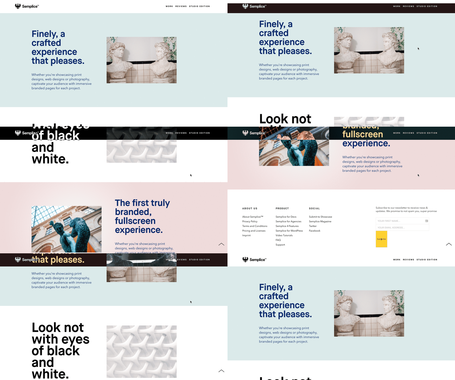
Navbar Exclusion Effect
You can easily replicate the 'exclusion' blend mode commonly seen in design programs such as Adobe Photoshop or Illustrator right into your navbar in Semplice.
You can view a live page example of this effect here.
Code Snippet
.semplice-navbar {
mix-blend-mode: exclusion !important;
}
